CAREPAY
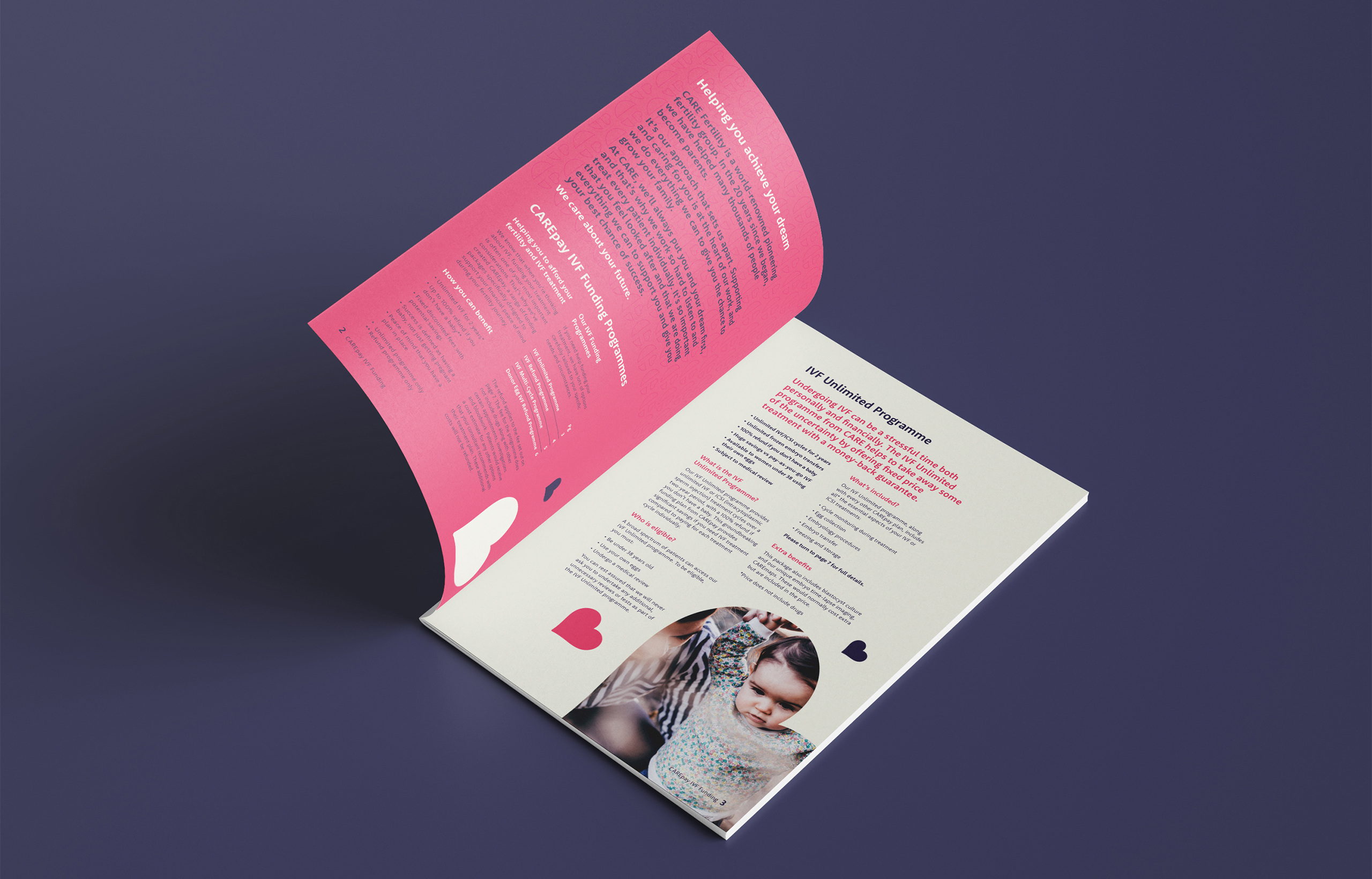
CARE Fertility is a world-renowned pioneering fertility group who have helped many thousands of people become parents over the last 20 years. It’s their approach that sets them apart. Supporting and caring for their patients is at the heart of everything they do. To enable them to provide a more seamless service to their patients they have created exclusive IVF funding packages, CAREpay. The range of CAREpay funding programmes are designed to make the cost of treatments easier to manage, leaving patients free to focus on making a family.
THE CHALLENGE
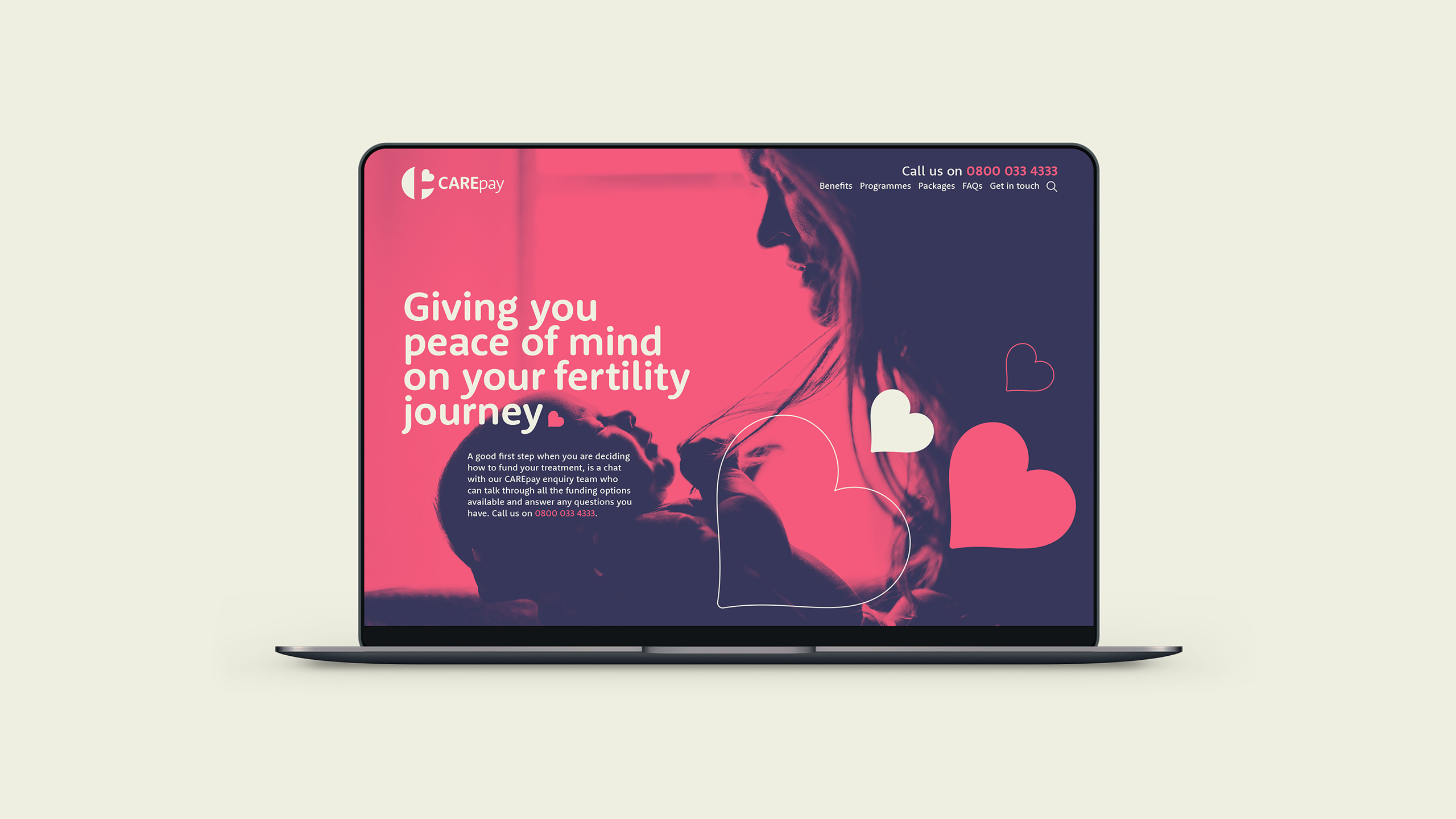
CARE Fertility approached us to create the name, brand identity and develop the brand language for the funding packages, to clearly differentiate them from their competitors and influence the brand strength and trust of CARE Fertility. It was a key stipulation that the CAREpay identity felt unique and independent to the CARE Fertility parent brand. It needed a look and feel individual to communicate trust, reassurance and support along with showcasing their passion for changing lives and creating valuable futures.

THE SOLUTION
Our approach was to create a name that clearly explains the role of the funding packages, by being ownable to CARE and true to the brand values, whilst adding positivity, warmth and without sounding clinical or transactional.
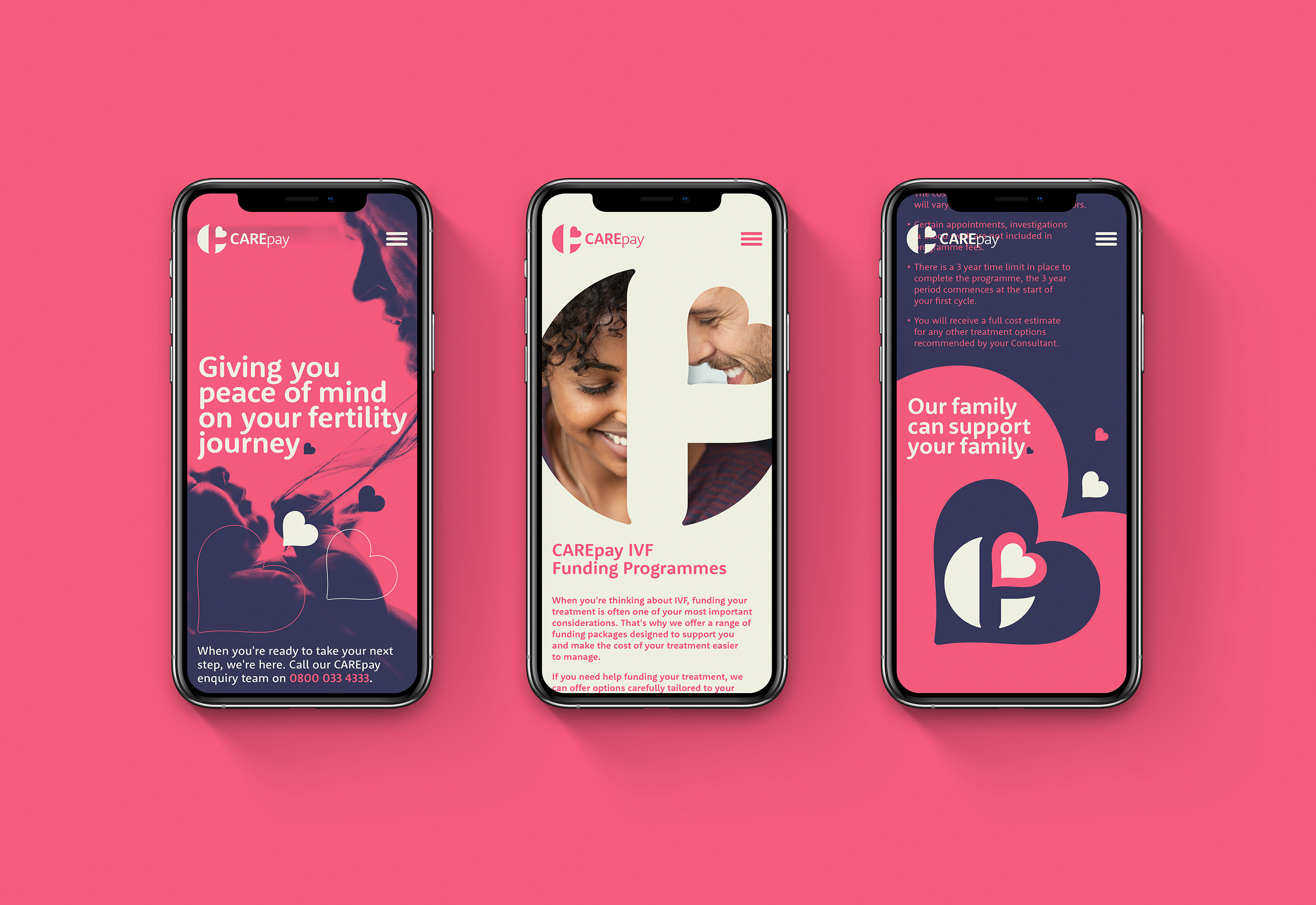
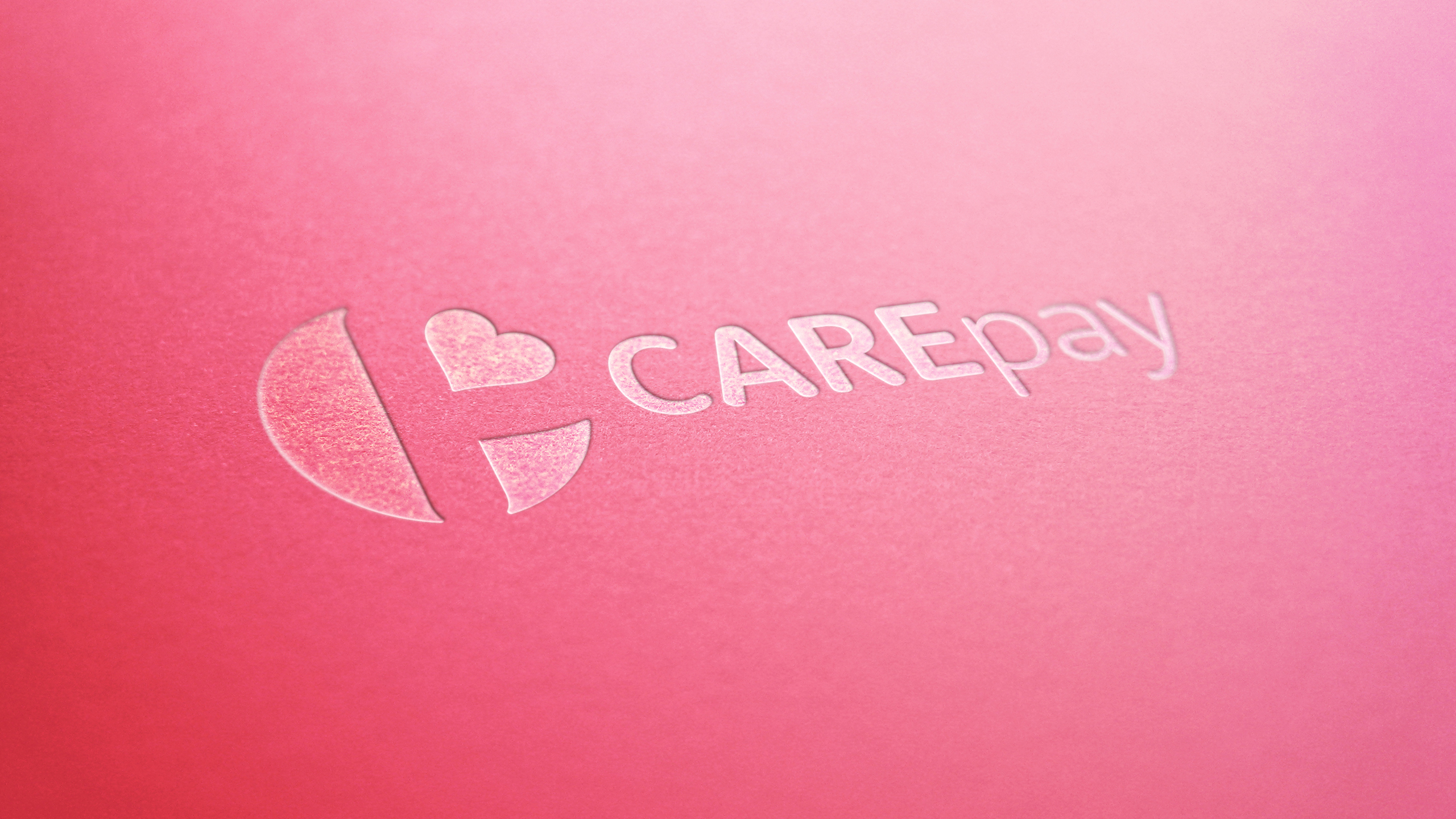
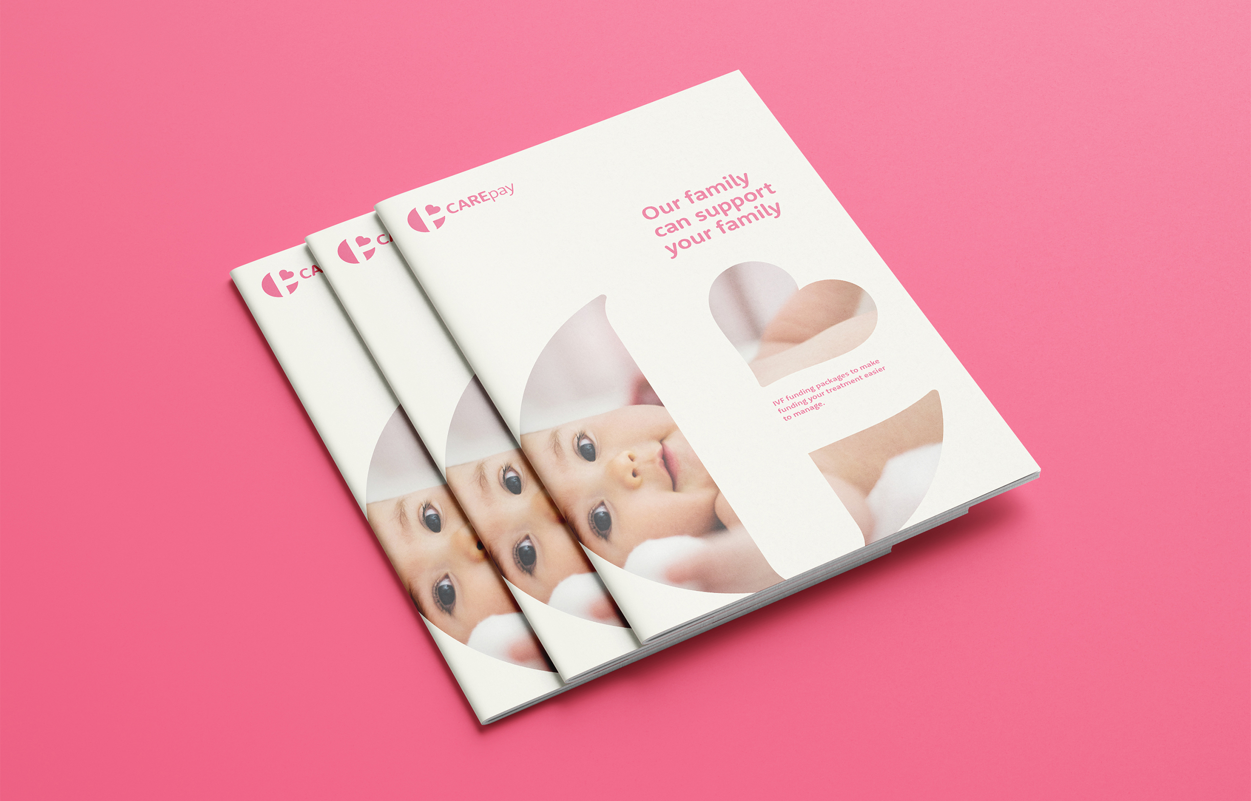
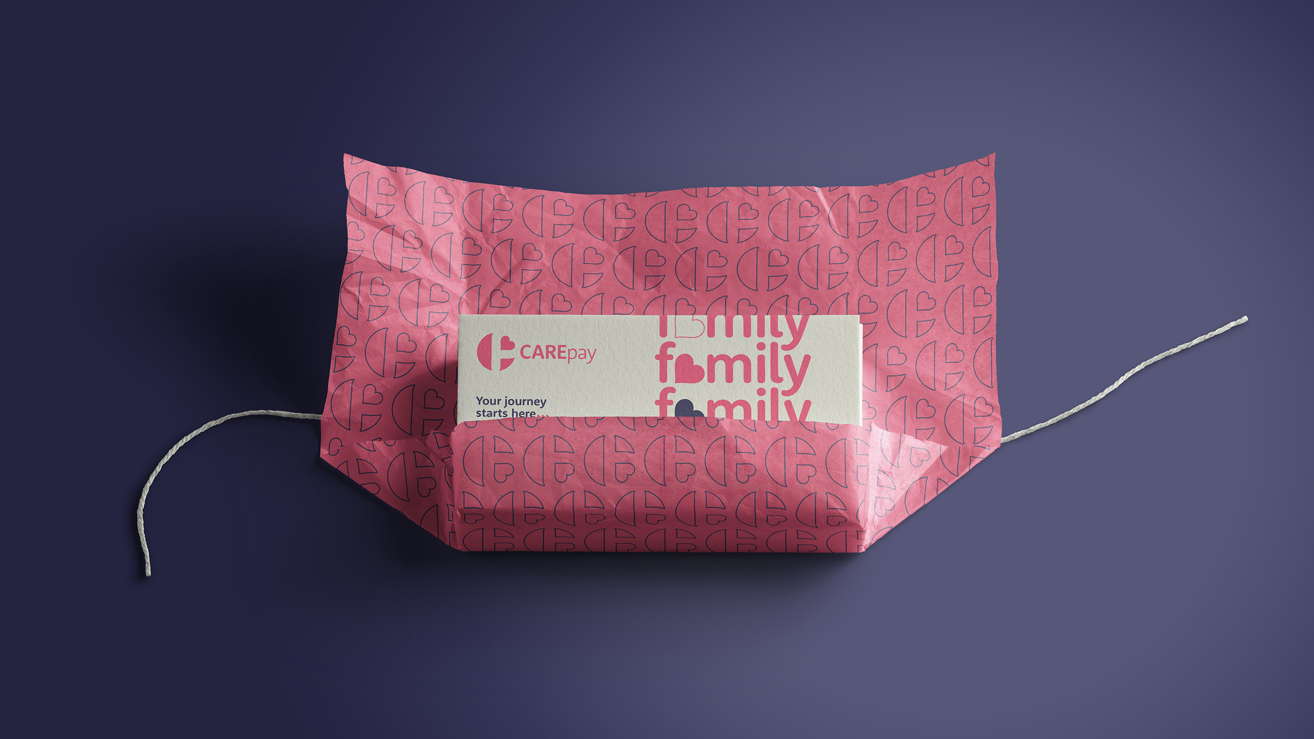
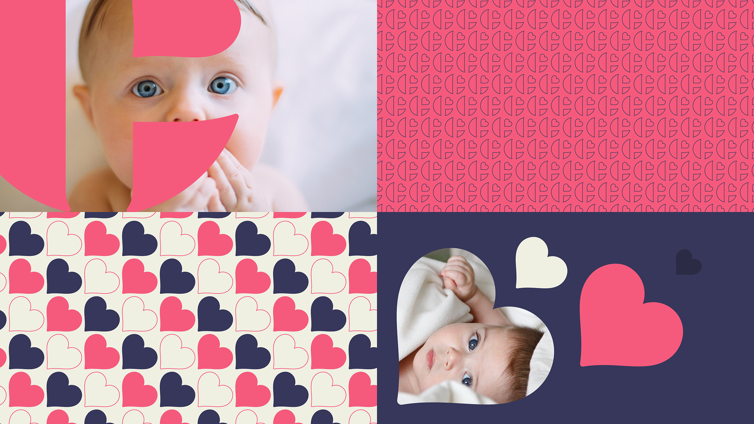
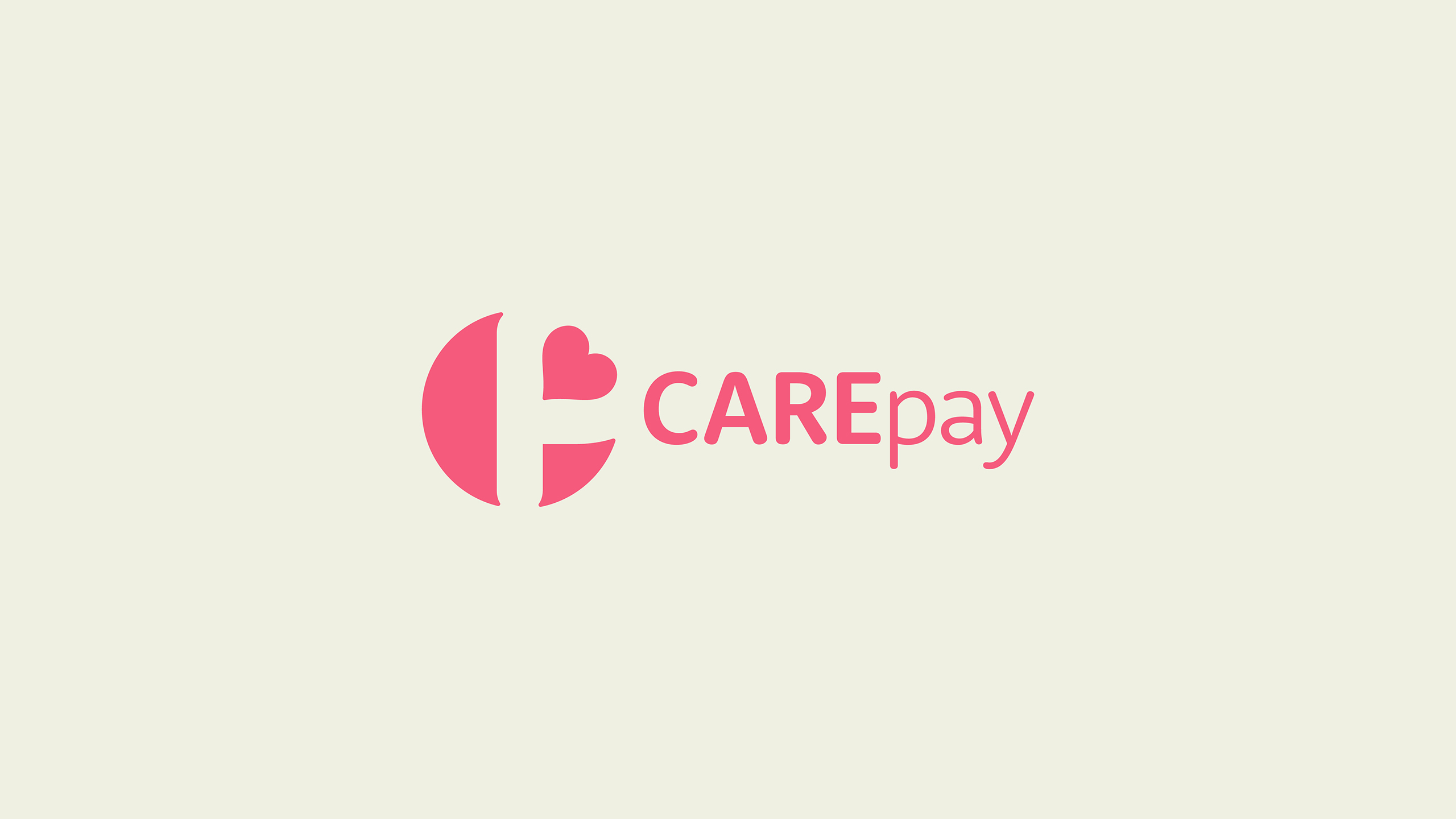
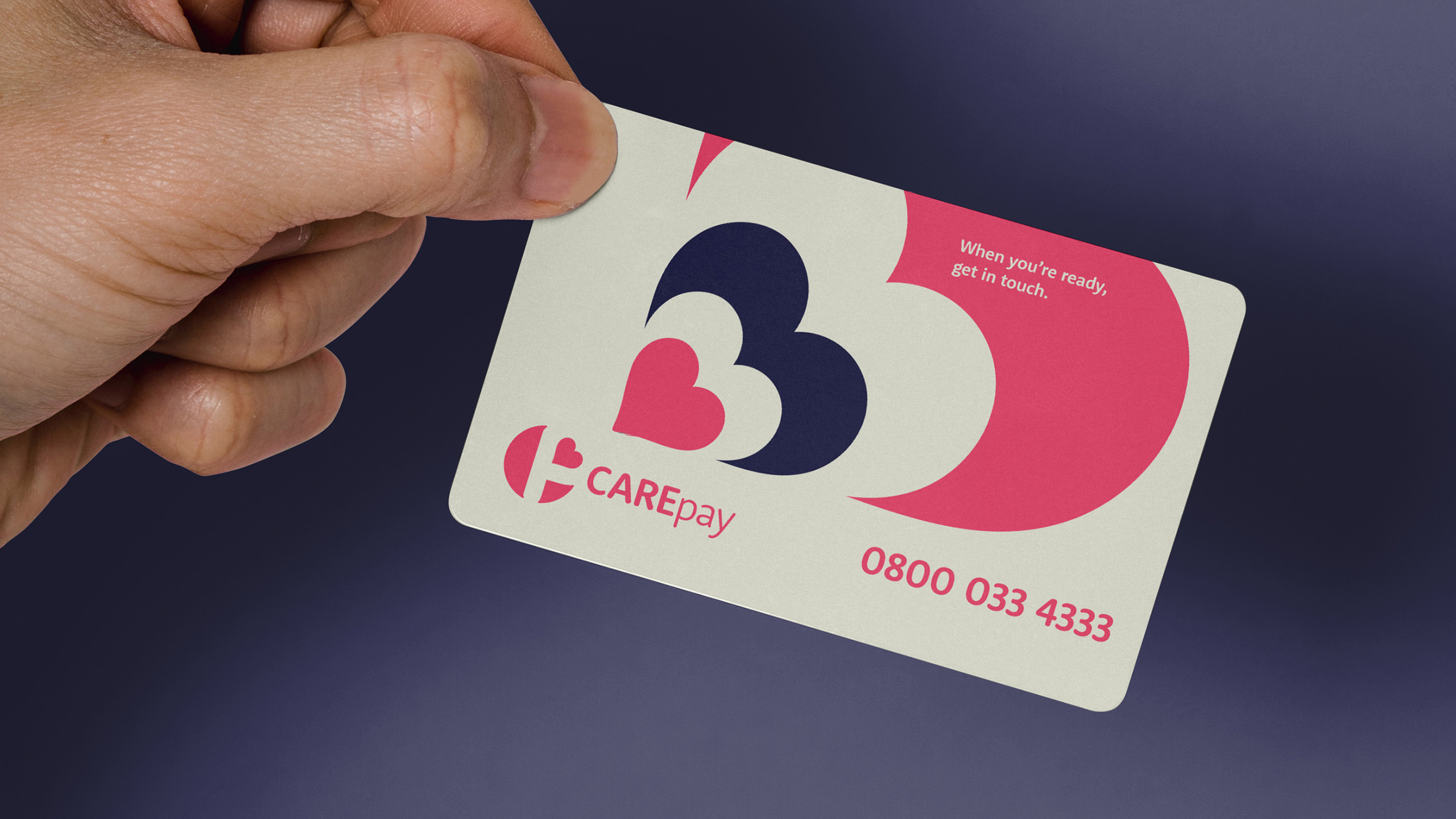
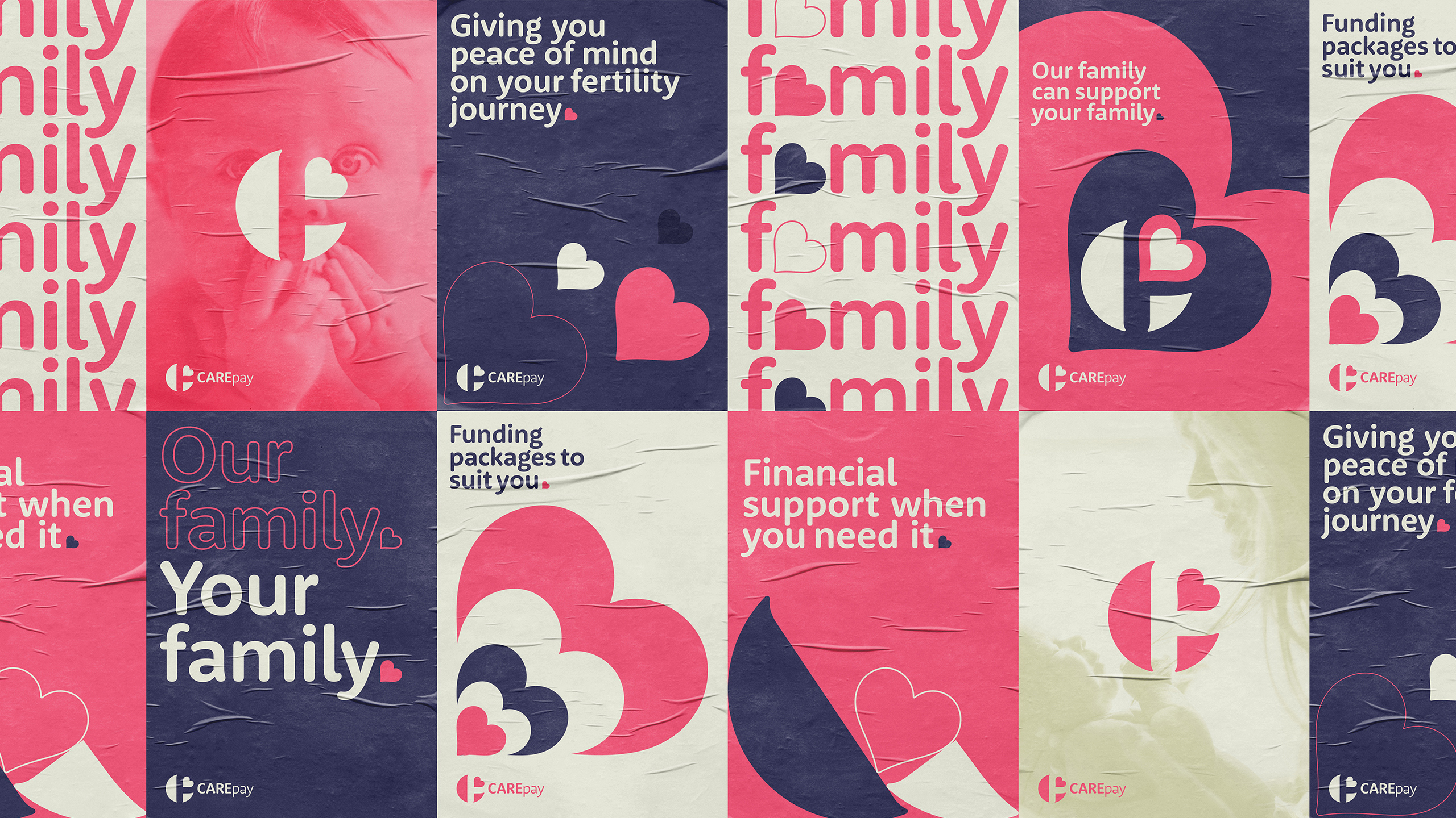
Using CARE’s brand essence ‘Family is for everyone’ as inspiration, the brand identity was created to work on multiple visual levels. Firstly, utilising a heart to symbolise love, care, positivity and hope. Secondly, the heart is positioned at an angle to represent a baby in the womb. And thirdly, the initials of CAREpay are represented in the symbol. All elements within the symbol form the letter ‘C’ for CARE and the negative space in between the parts make the letter ‘P’ for pay.

THE SOLUTION
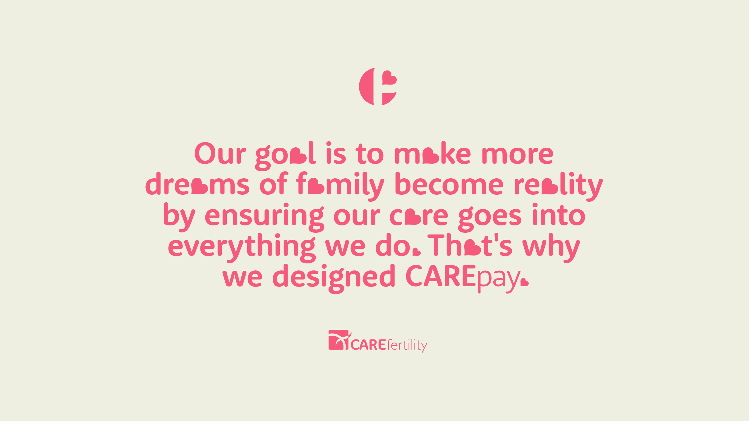
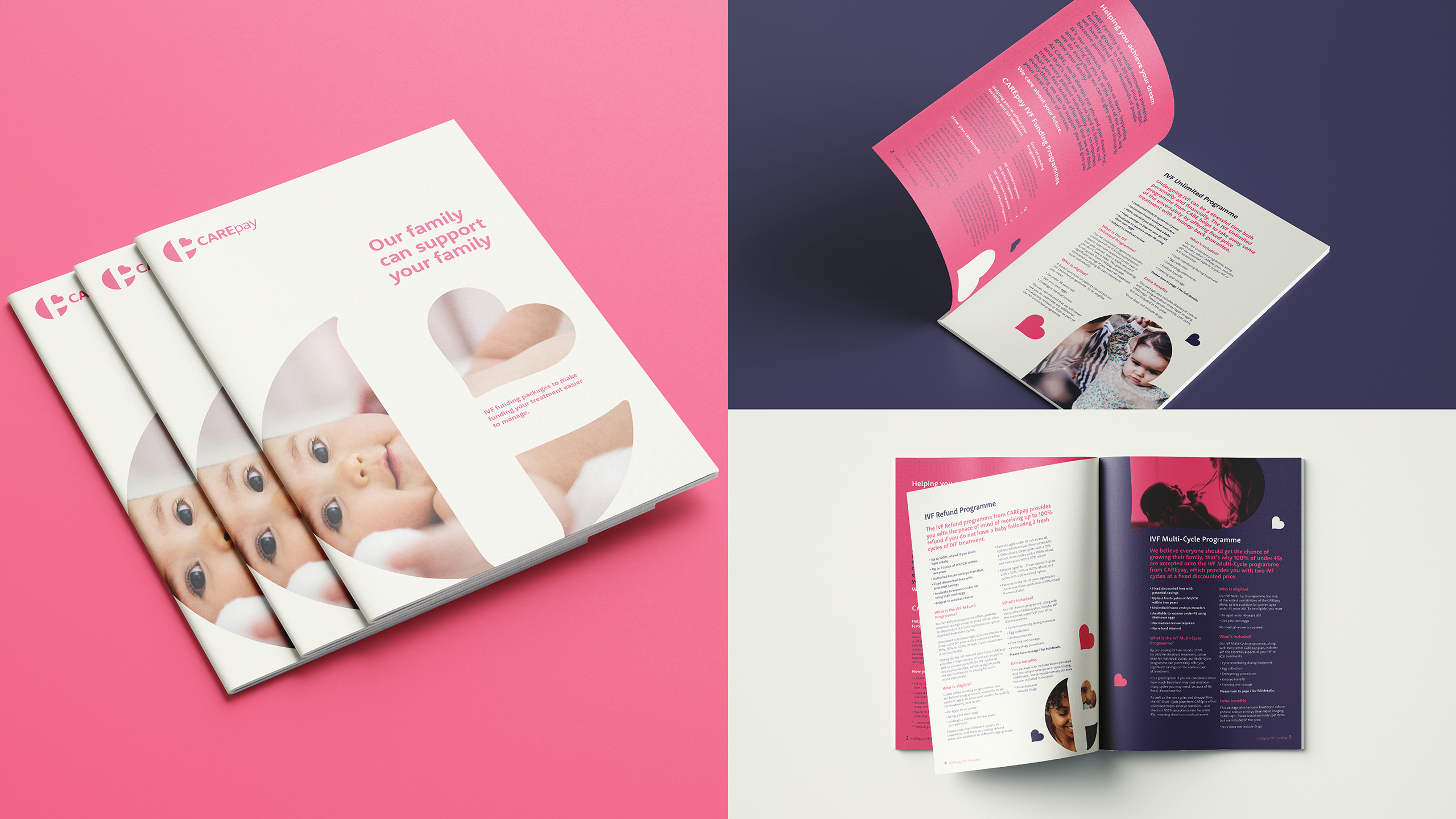
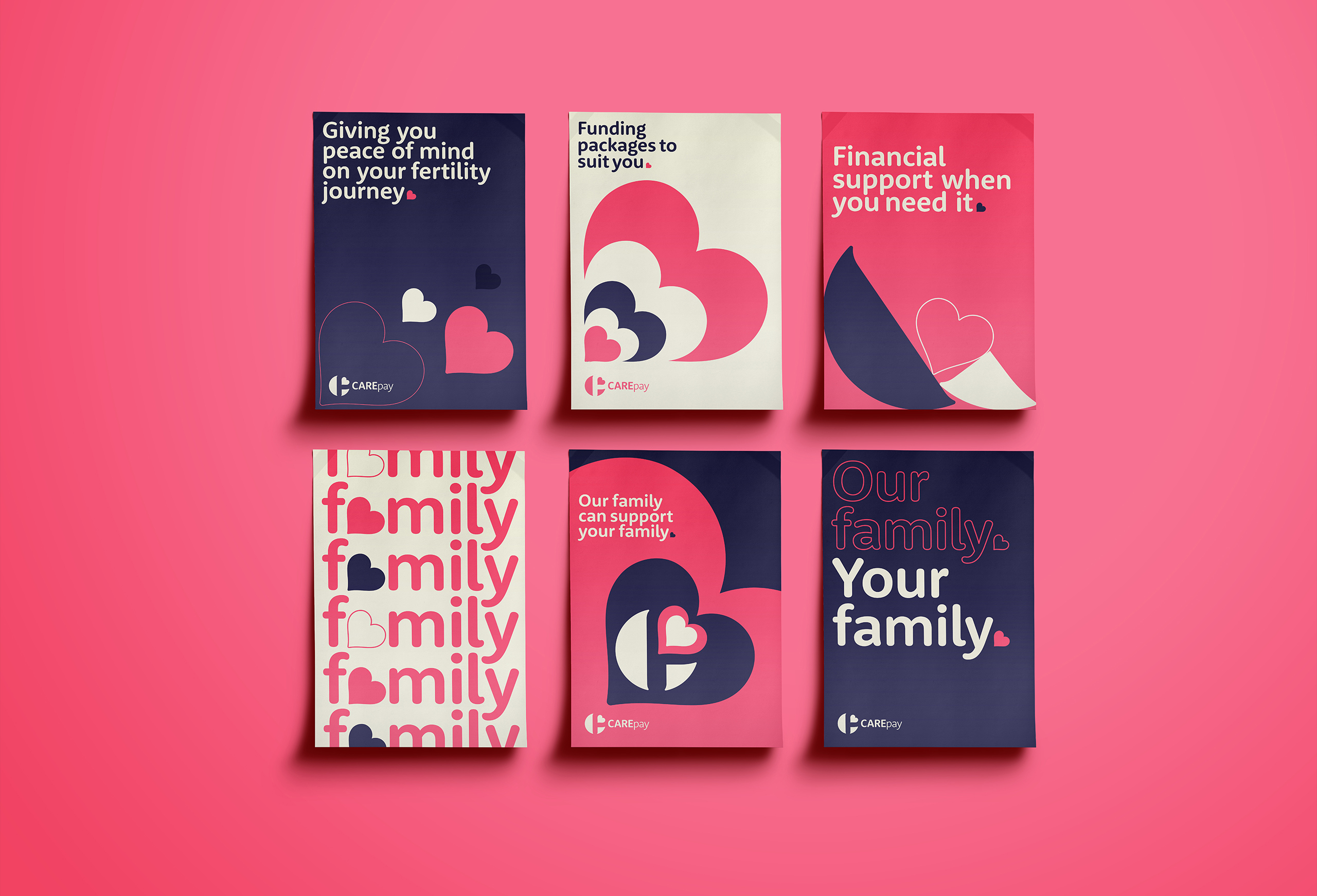
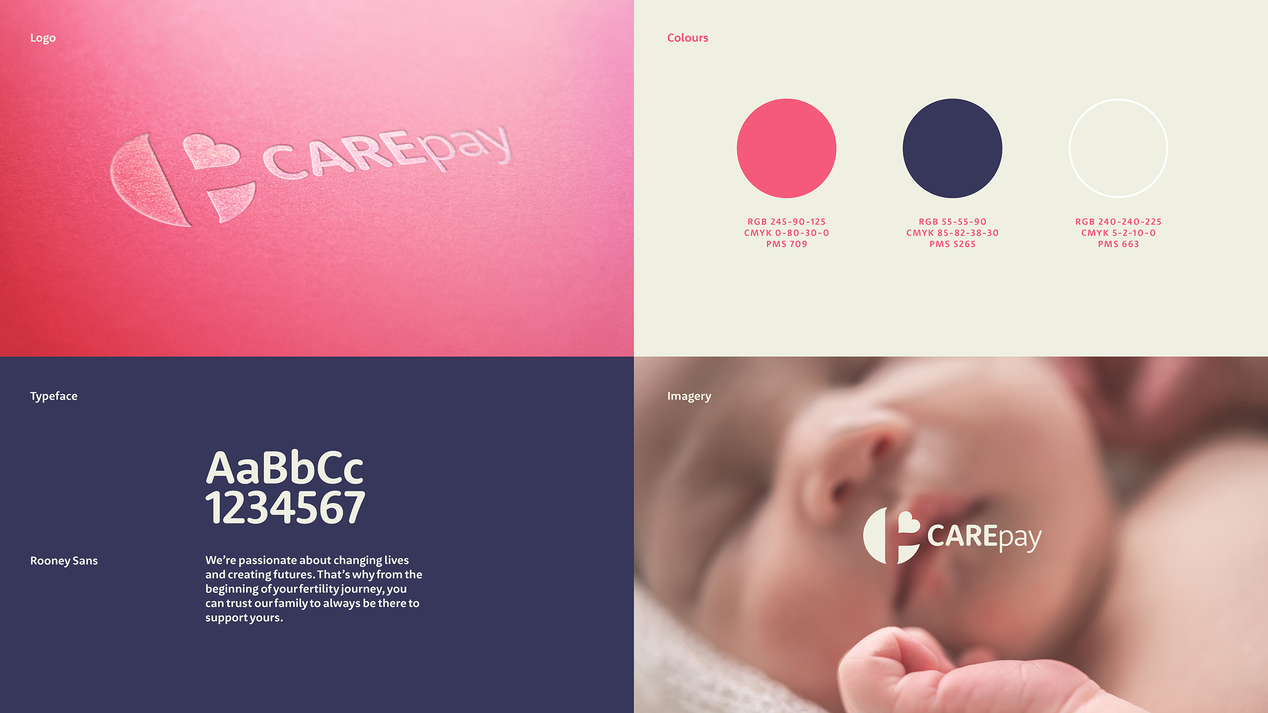
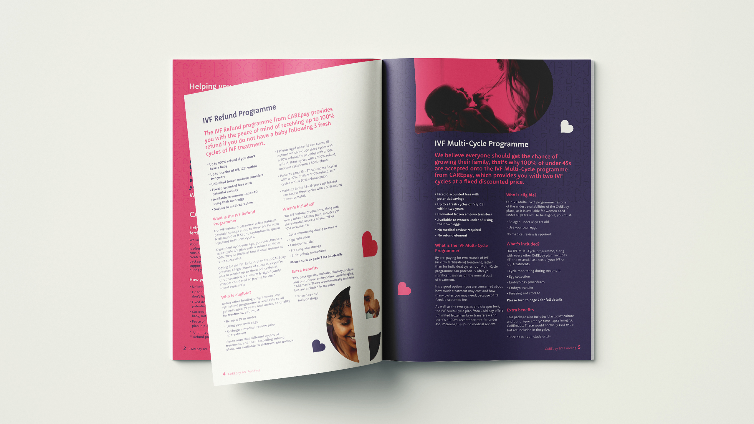
The brand language uses a warm colour palette along with rounded letterforms for the typography and bold graphics. The warm pink symbolises the womb, warmth, positivity and love. While the blue represents, confidence, professionalism, knowledge and innovation. The chosen typeface is rounded to convey a language of trust, comfort, warmth and a friendly tone of voice. The graphics are bold, clear and uncomplicated, which create a simple visual language that supports the overall message of ‘Family is for everyone'. Combine all of these elements together and the brand language emphasises CARE Fertility’s brand proposition of gaining trust to support couples on their journey to becoming a family.
