Guiding Light
Guiding Light is a new UK charity that has been set up to protect children in Nepal from sexual abuse by providing them with safety and shelter in dedicated safe houses.
Working closely with local Nepalese charities, Guiding Light ensures that these vulnerable youngsters also receive ongoing counselling, education and the chance to enjoy recreational activities.
The Challenge
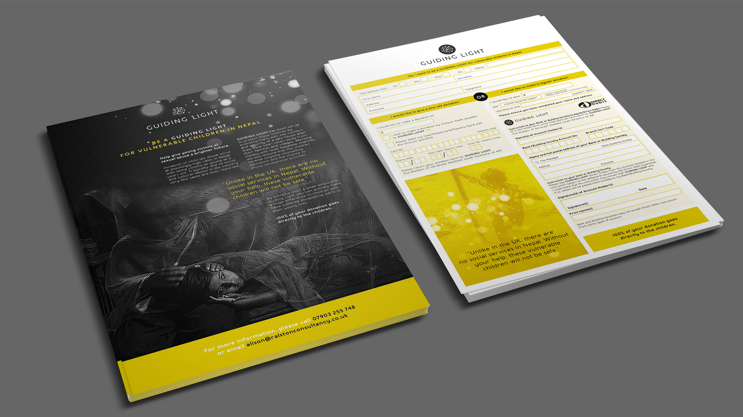
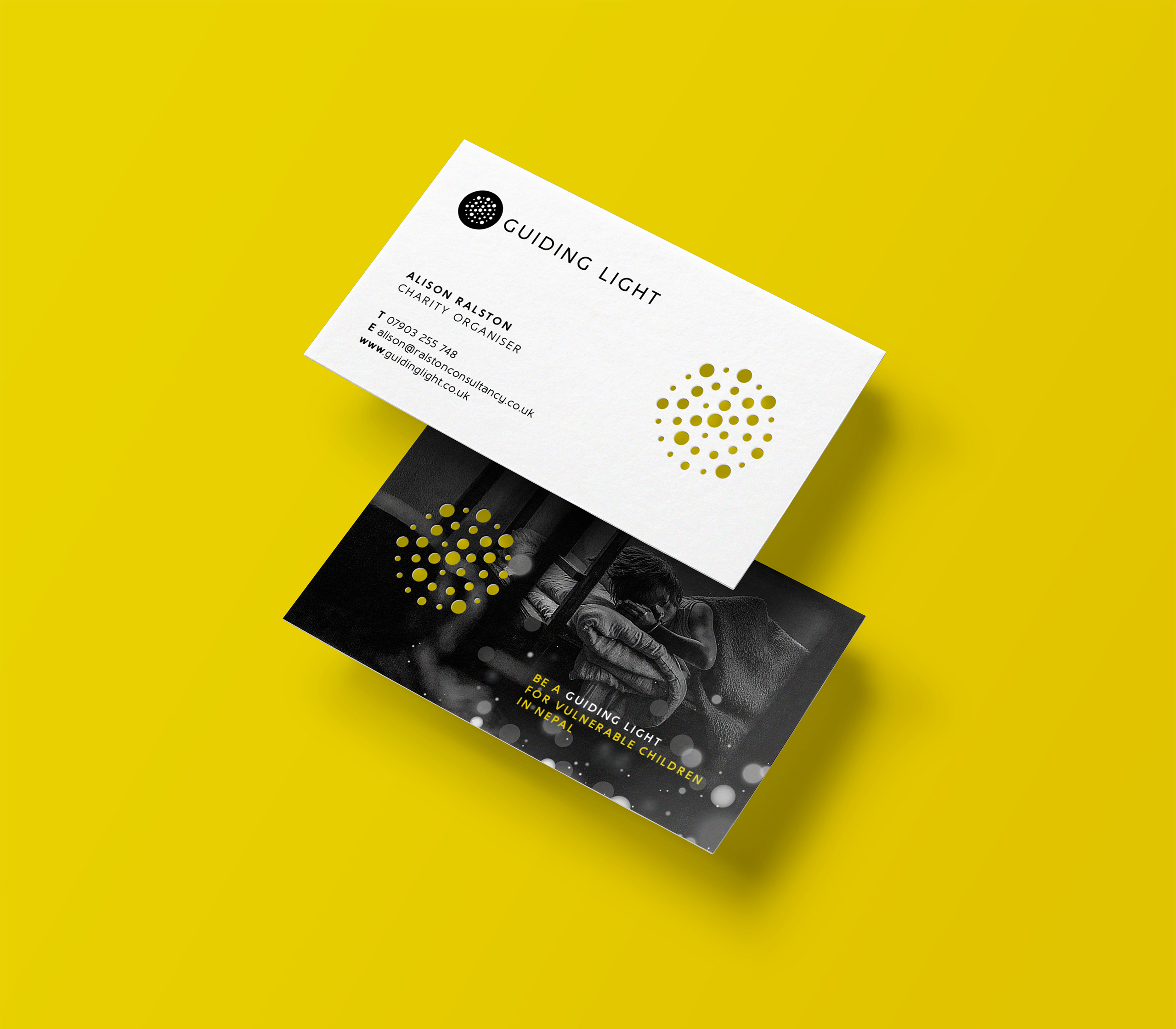
To create a brand identity and tone of voice for Guiding Light, to enable it to achieve cut-through among a crowded charity sector and engage with and motivate people to contribute funds.
A degree of sensitivity was needed to respect the serious nature of the cause, whilst at the same time offering a sense of hope and positivity for the future.
The Solution
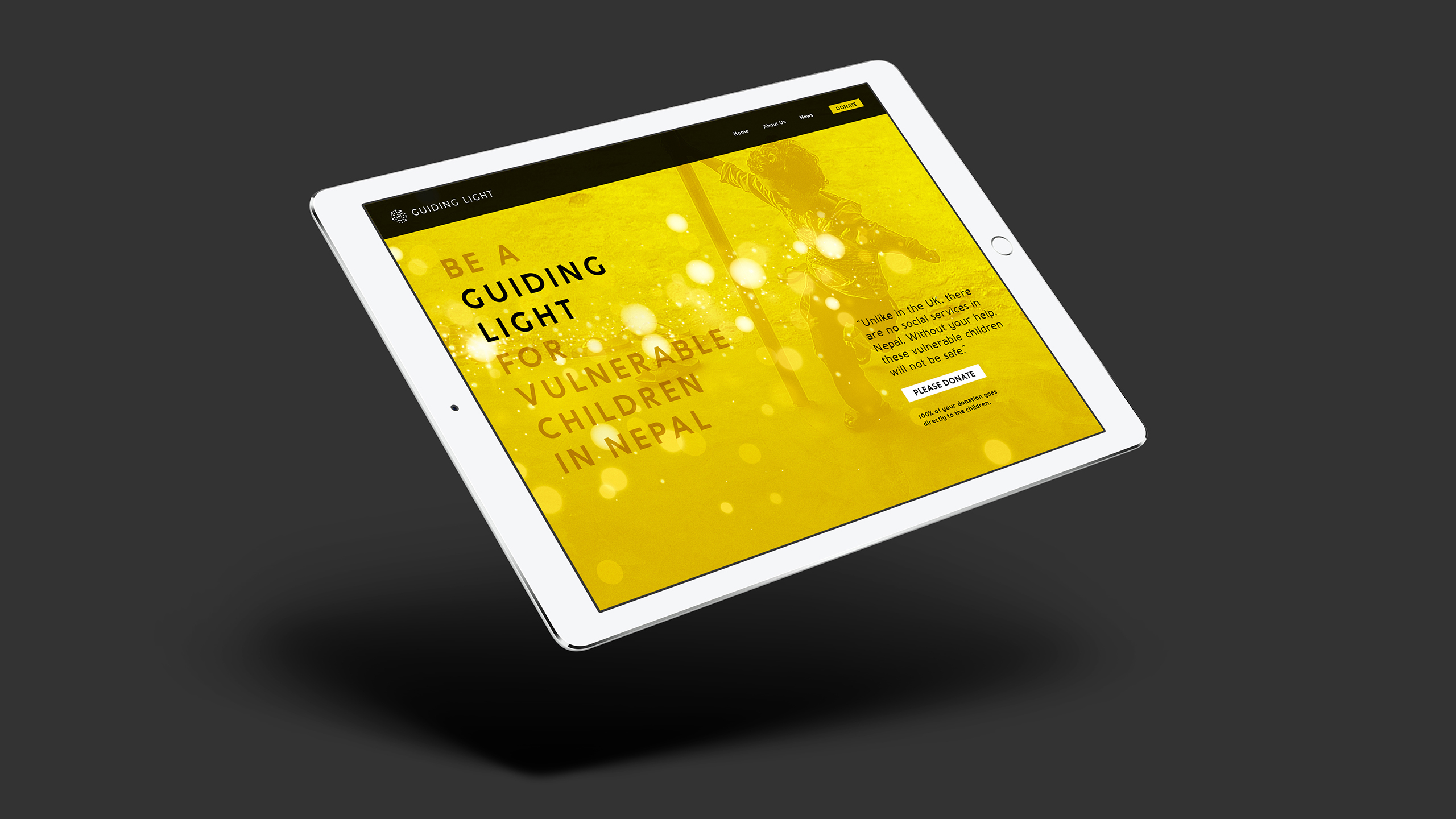
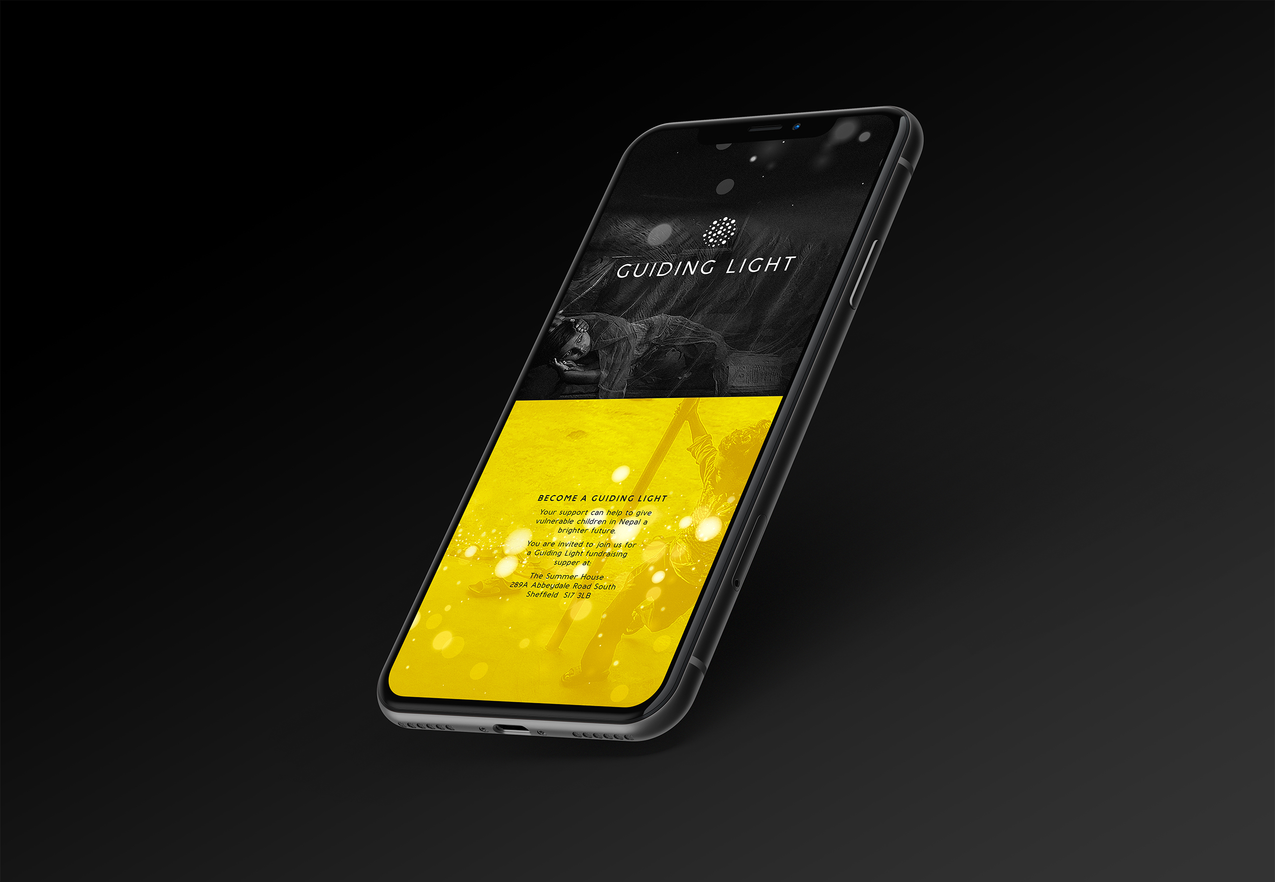
An identity was created that represents the charity’s titular ‘Guiding Light’ within the darkness, suggesting a ray of hope for these unfortunate children to ‘guide’ them to a much brighter and happier future.
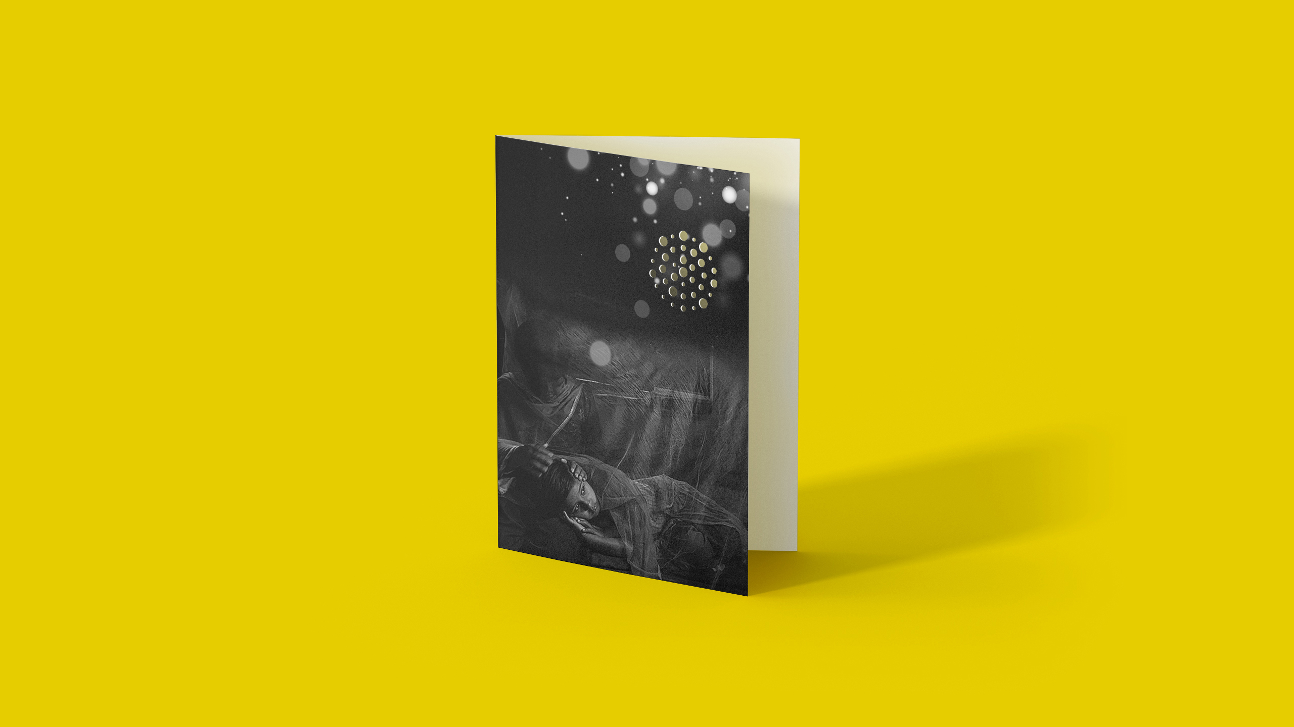
There is no greater symbol for hope than light. The marque of the identity consists of a cluster of circular lights (with a bokeh blurred lighting effect to add subtle emphasis) grouped together in a globe, which conveys the idea of a global presence for the brand – in that people in the UK are willing to help Nepalese children as benefactors, patrons or volunteers etc.
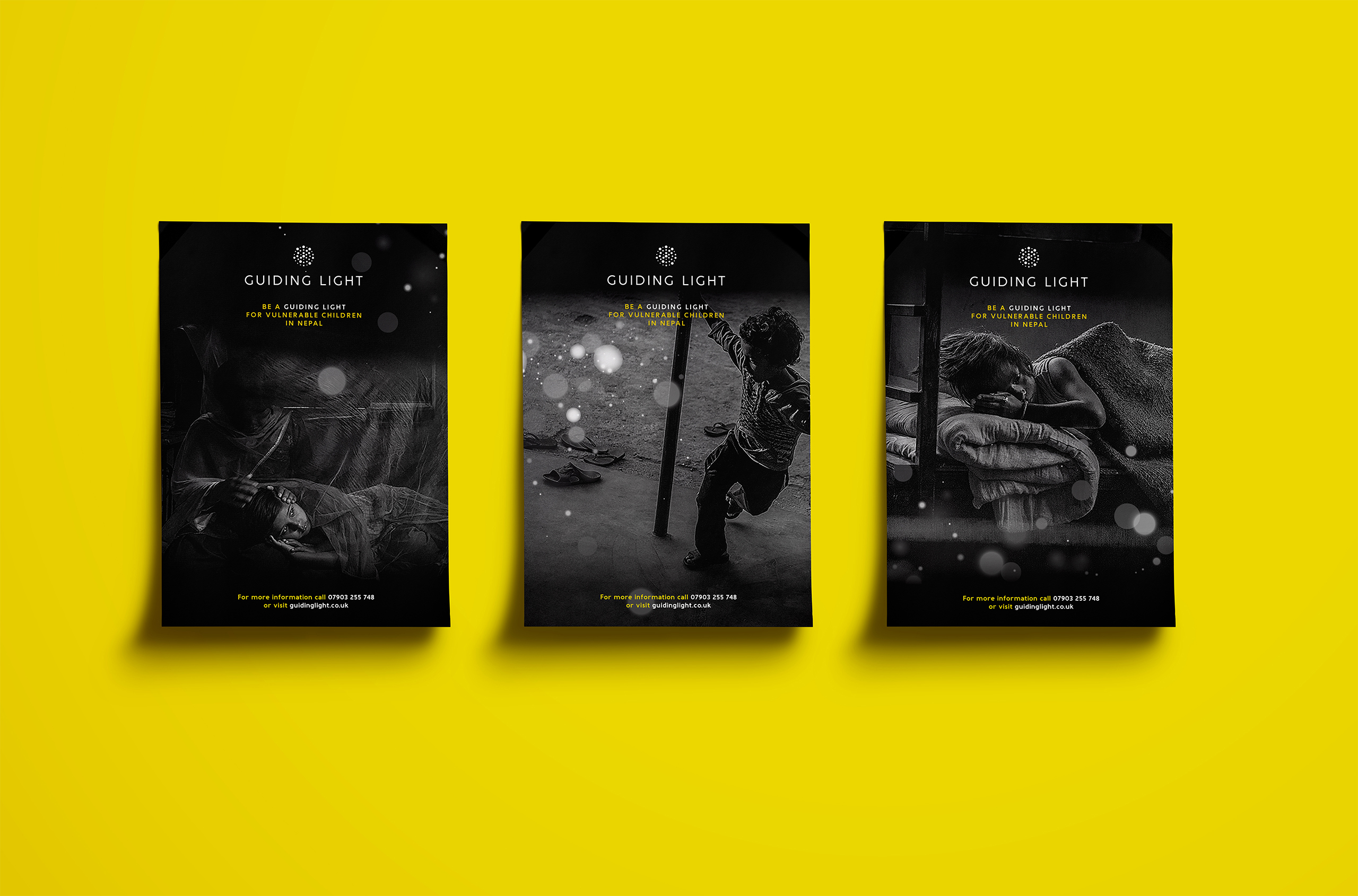
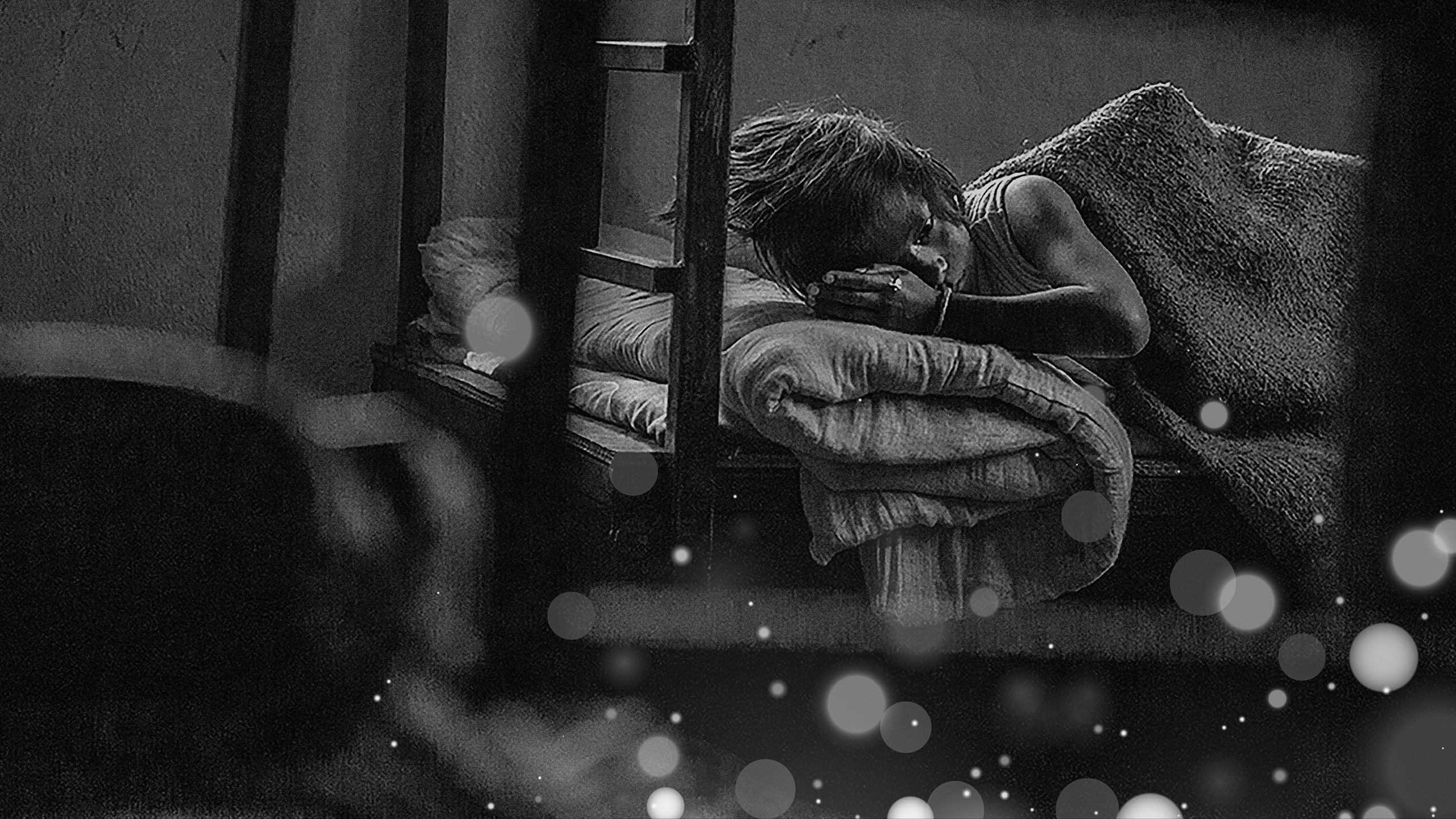
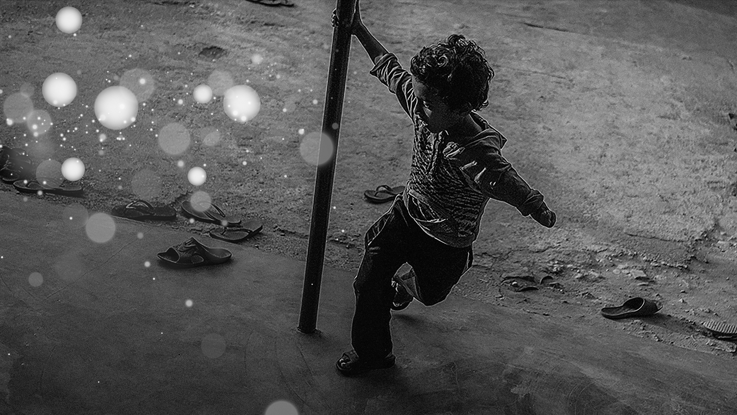
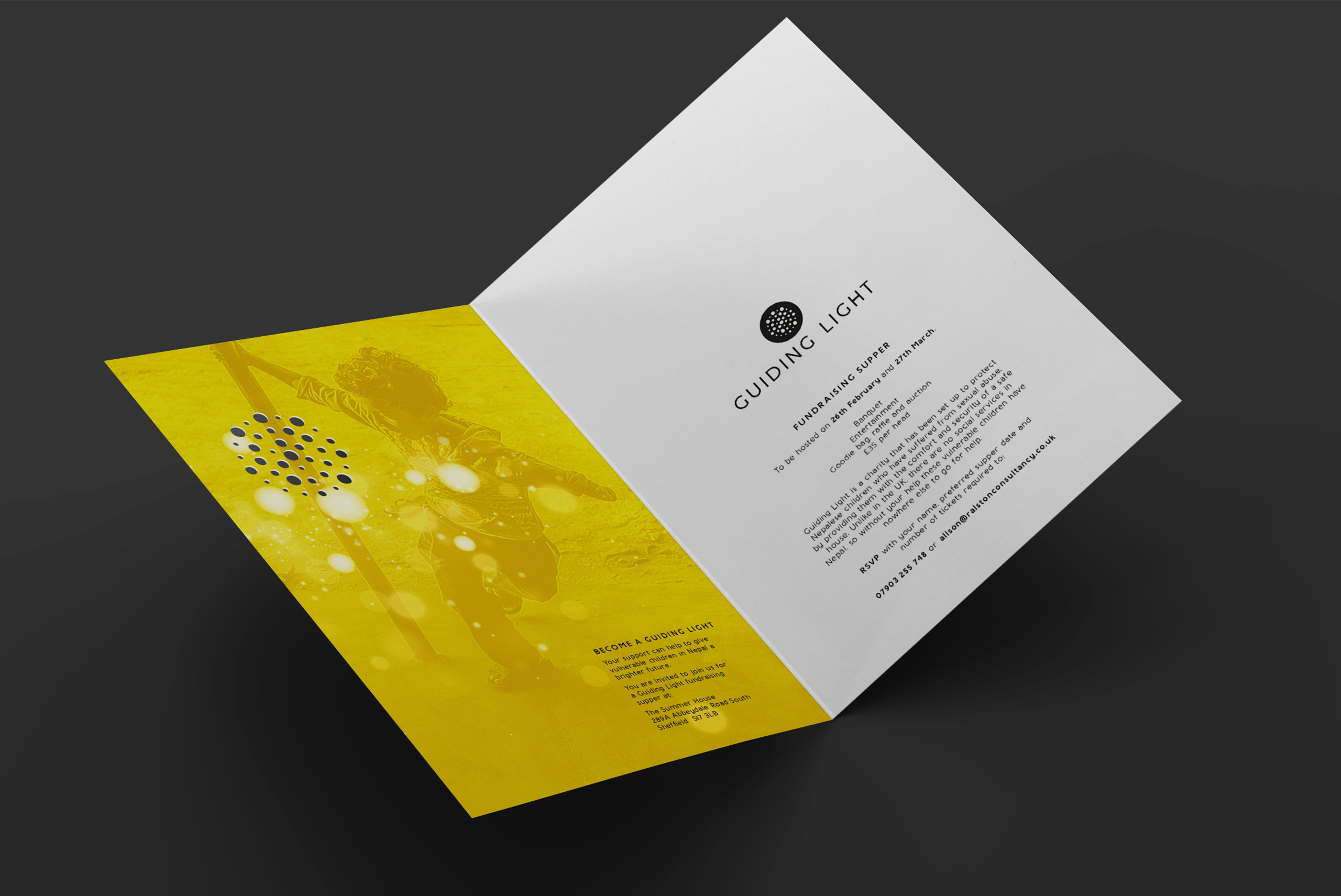
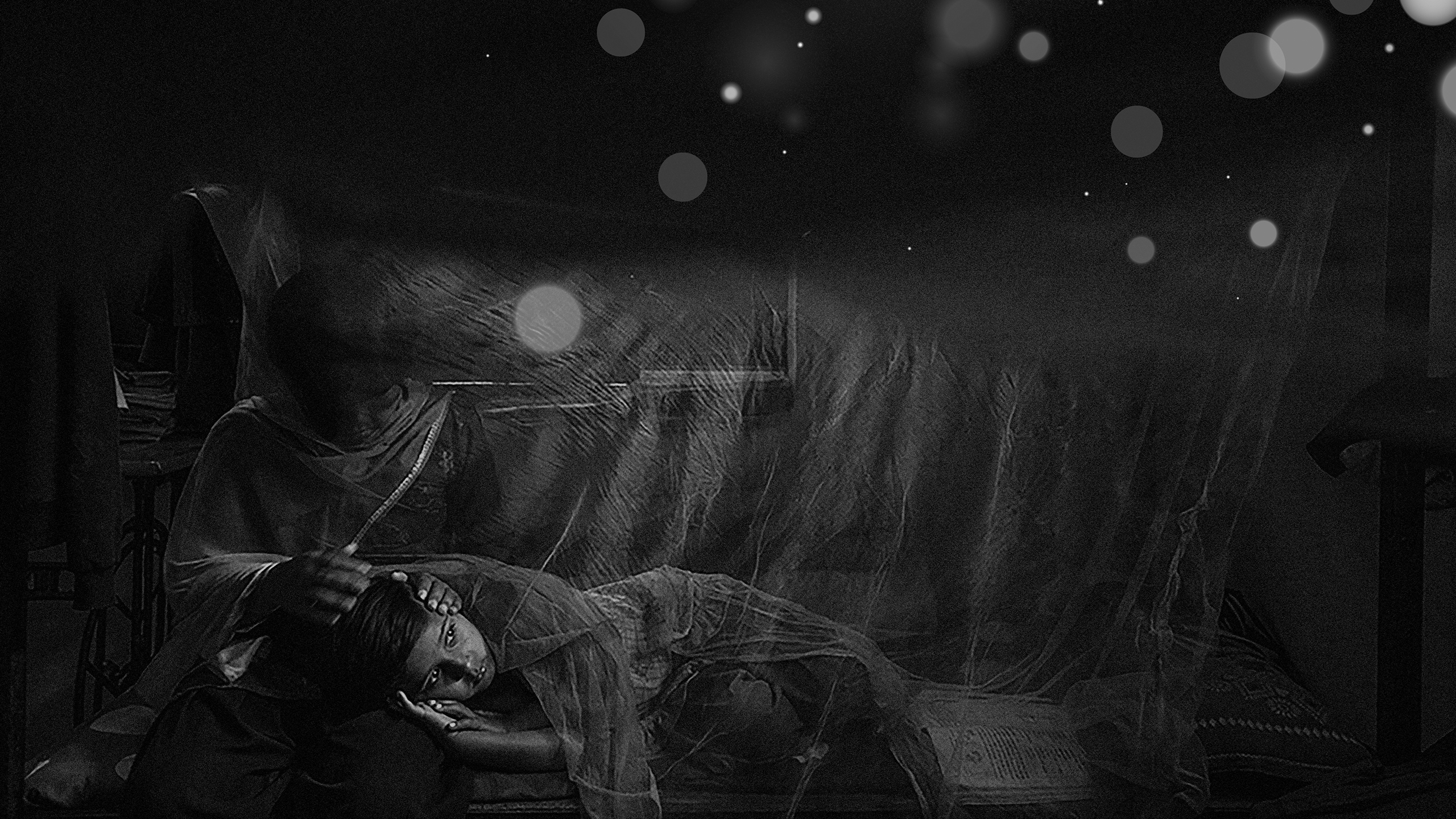
Black and white photography was selected to offer a sense of the realism of the problem in Nepal and typography kept clean and simple for clarity. This style was combined with a minimal colour palette to provide a serious tone and respect to the nature of the charity. In contrast, the bright white and yellows stand out as a beacon of hope and inspiration to provoke a positive response from would-be donors to become guiding lights themselves.
